Kanvas
Laying the foundation of a design system
As the design system lead, I worked with our Engineering Lead to grow a community-driven design system into something teams could rely on. On a small team, I ran roadmap planning, weekly reviews, mentoring, and set our best practices.
An interactive north-star demo of the Kanvas workspace
Auditing the design system
The existing design system had been a community-driven effort with no real leadership. To understand where it stood, I audited the components in code and Figma to see what was used and what was missing.
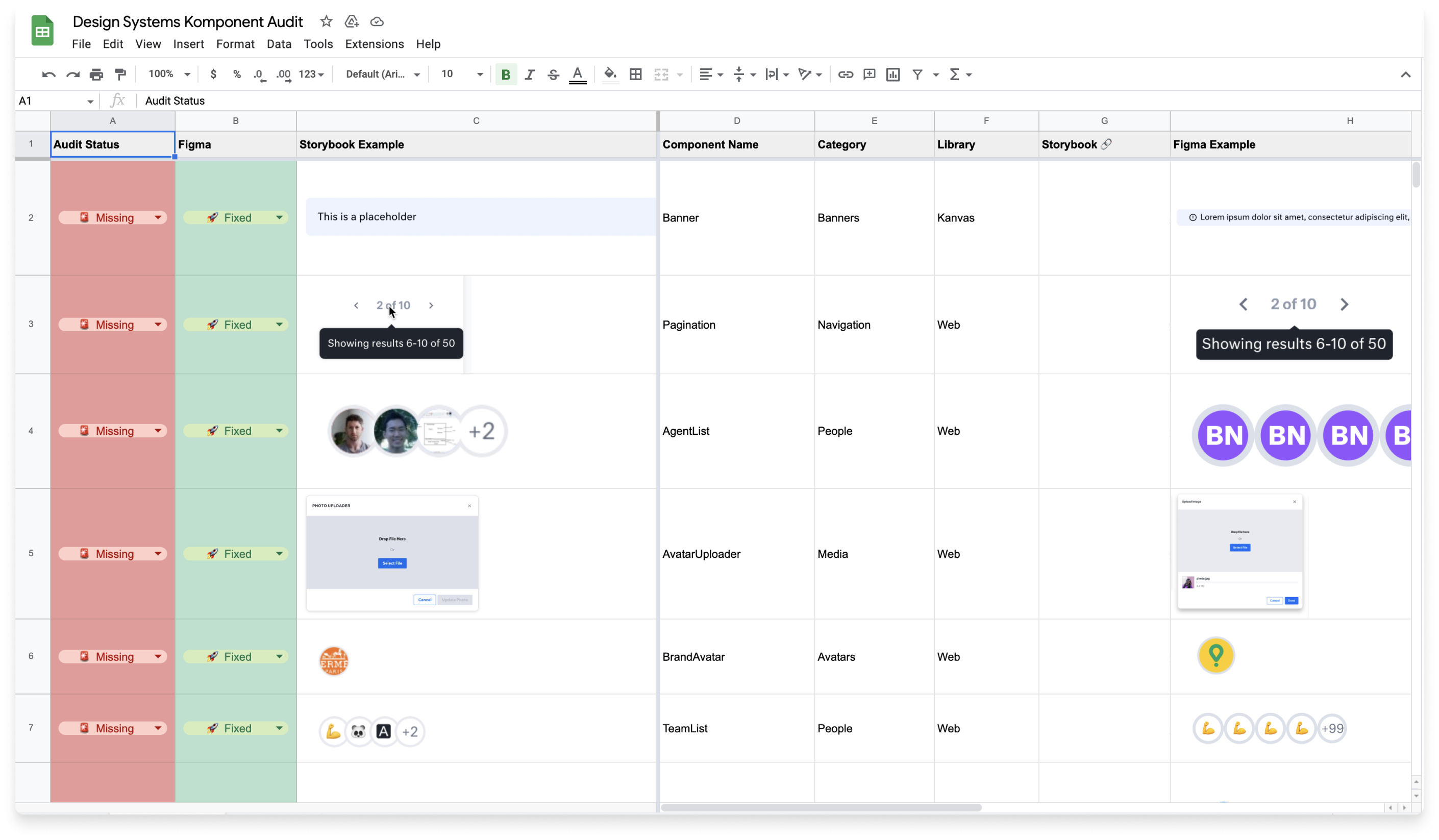
Auditing every component across code and Figma in a shared spreadsheet
Influencing the work
To prioritize the work, we needed leadership behind it. With the Engineering Lead, I mapped out a roadmap for the year: project scope and an execution plan.
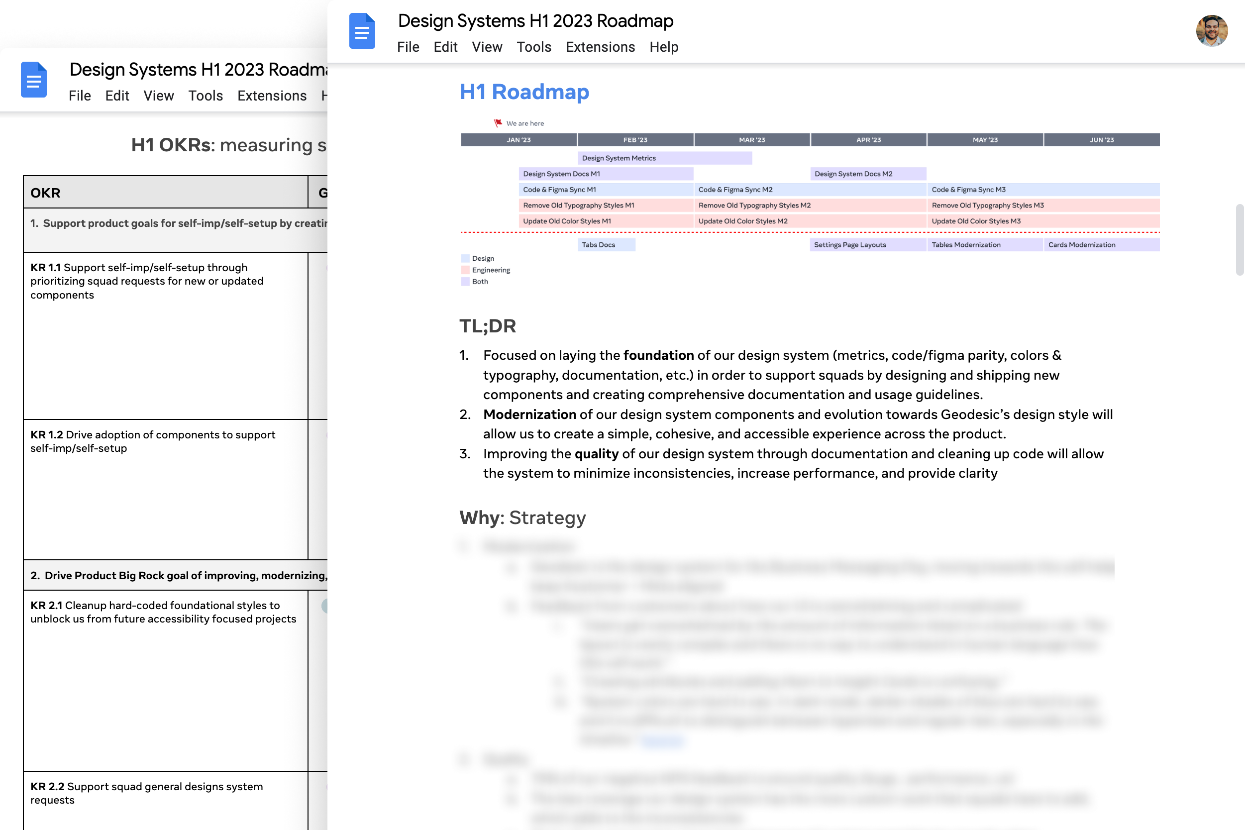
The H1 2023 roadmap and OKRs we pitched to leadership
Making the updates
After receiving approval from leadership, we began updating our design library to match our code components. Over the next four months, we beat our expectations and hit our yearly goals. We also started sharing progress with the rest of the org, to show what the design system was doing for the product.
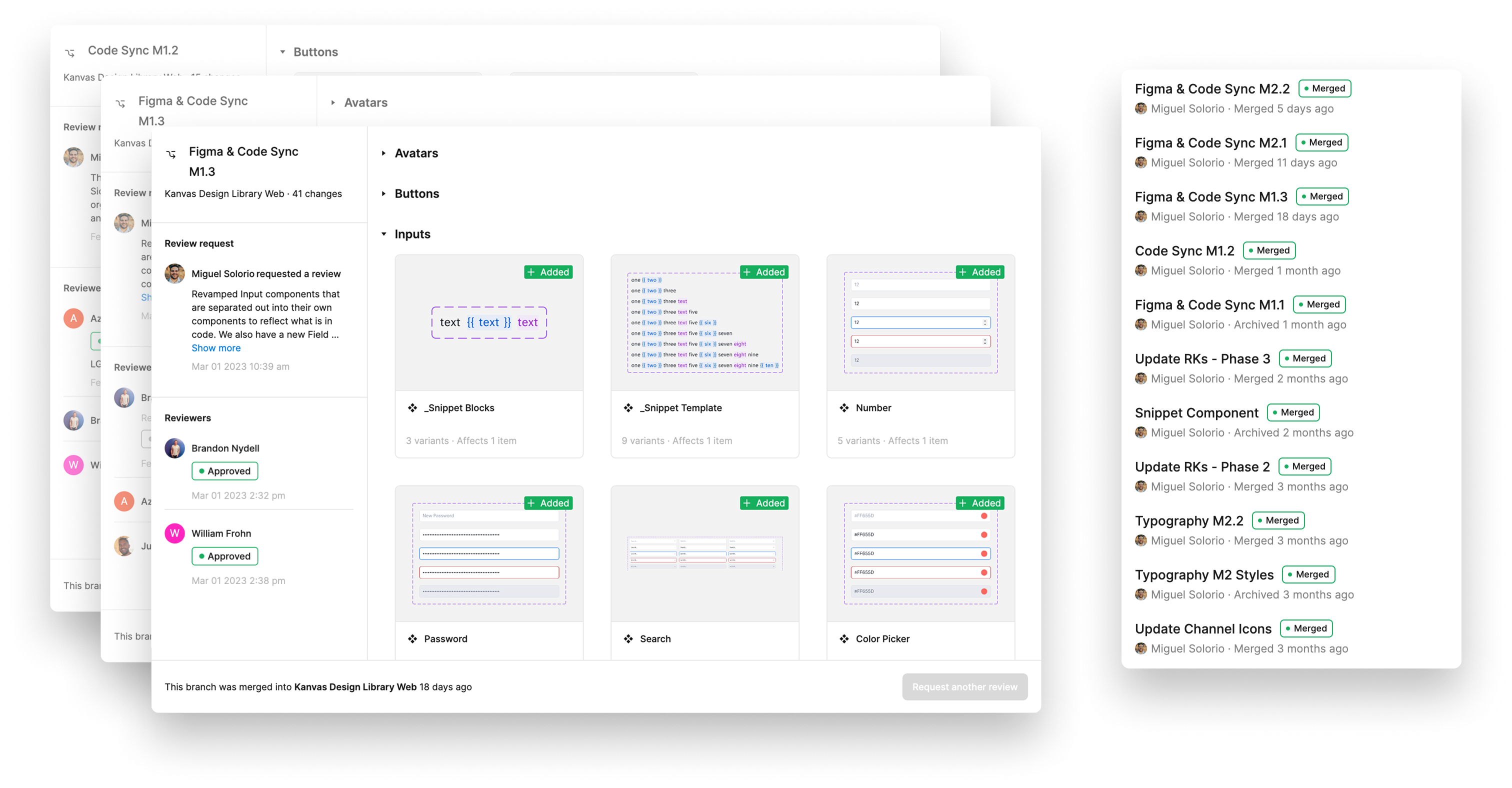
Shipping the library in reviewed, versioned Figma branches
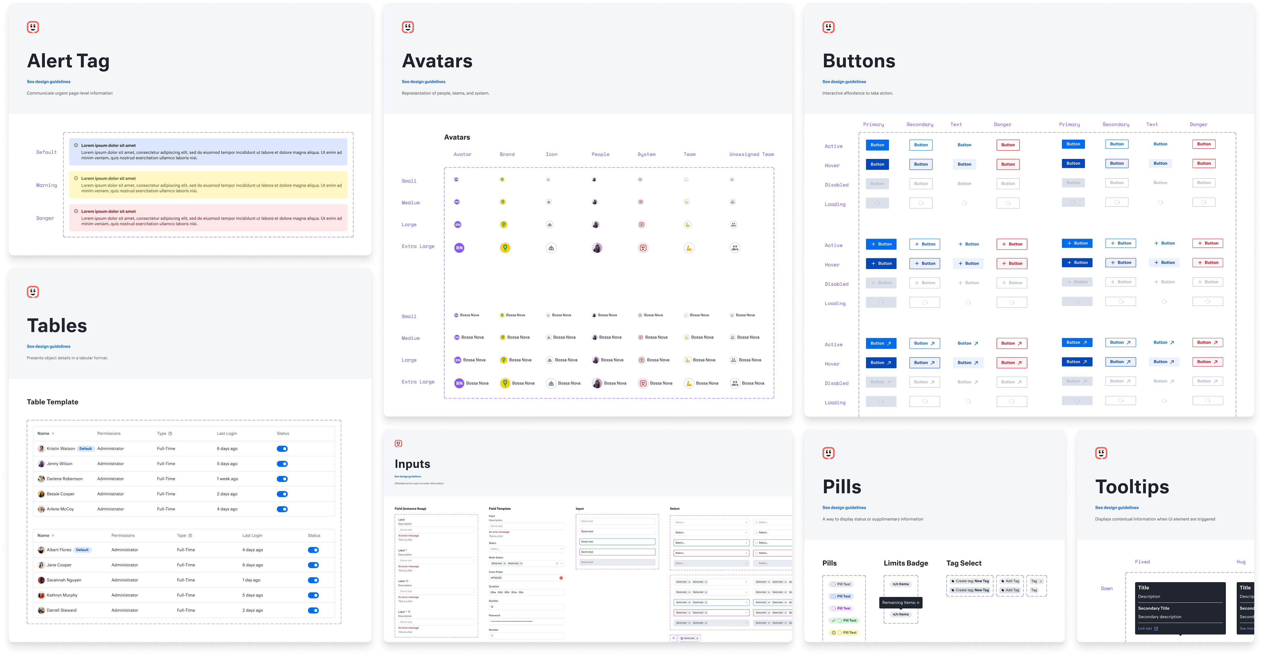
The refreshed Kanvas library, from alert tags to tooltips
Tracking changes
To keep everyone current, I documented changes in our Figma files and posted a note with each release, so people knew what had changed.
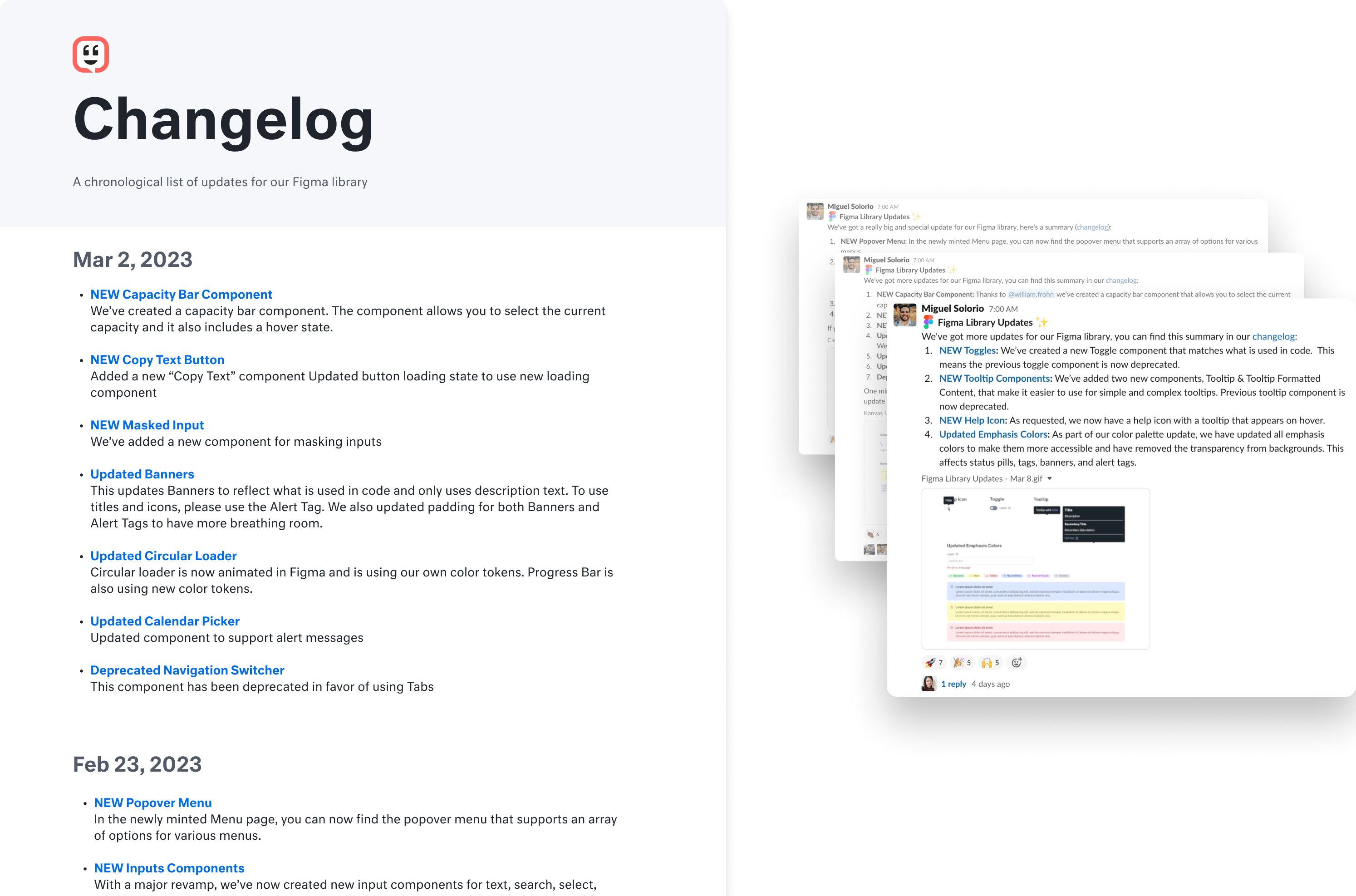
Every release documented in a changelog and announced in Slack
In-progress work also needed to be visible. This led to the creation of our component tracker, which was part of our product documentation and roadmap. This made it easier for people to view the updates and see what was coming next.
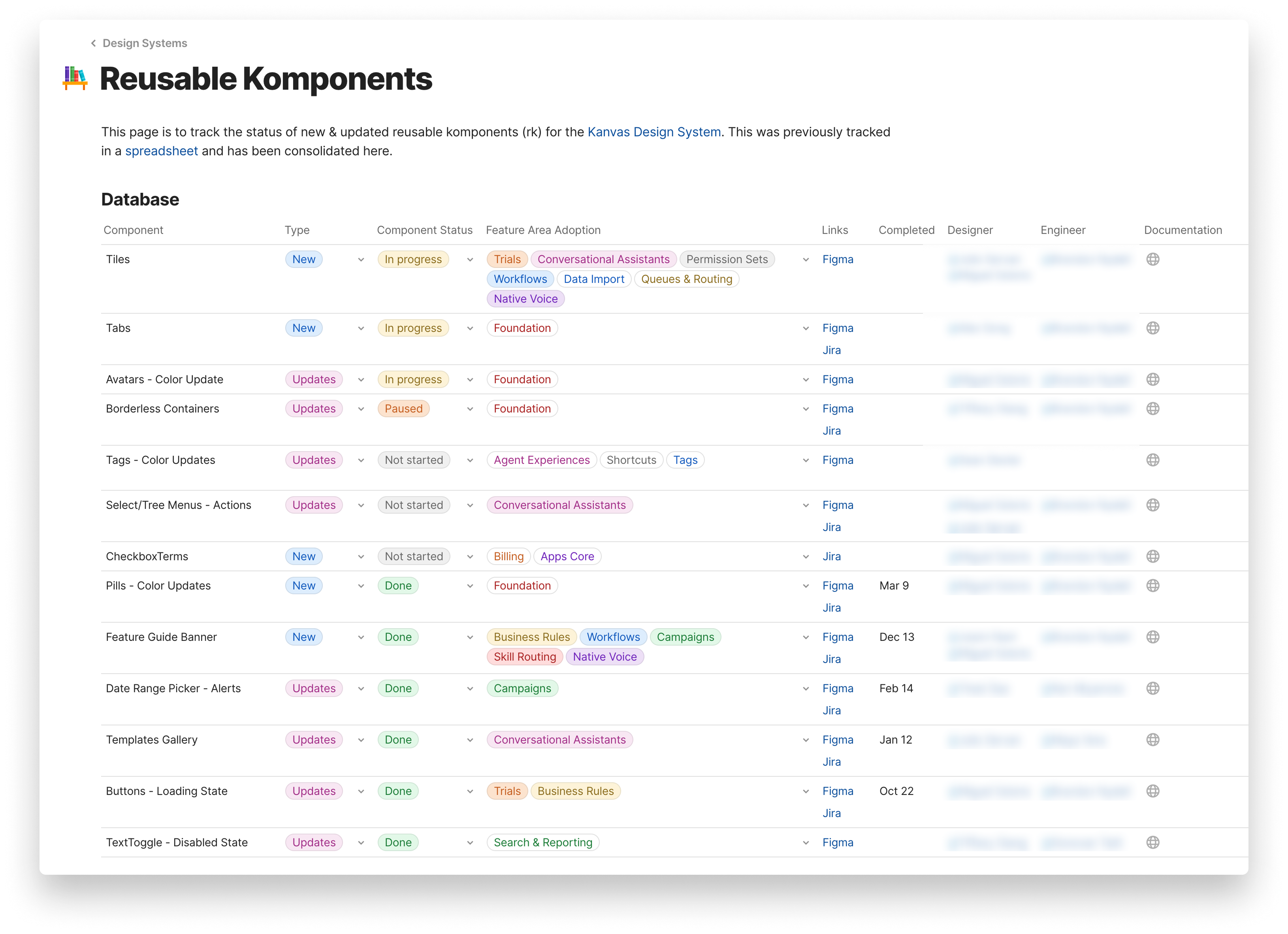
The component tracker gave everyone a view into what was in flight
Accessible components
Beyond parity between design and code components, I made sure we built them with accessibility in mind. We tested each one against a set of requirements (color contrast, keyboard navigation, theming) and made sure it worked for everyone.
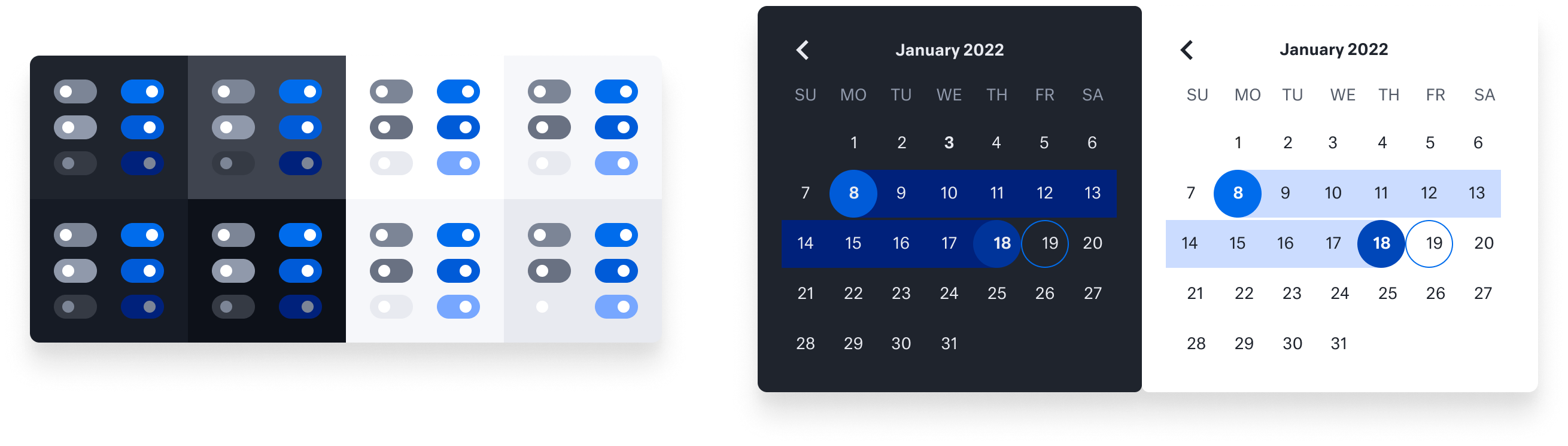
Checking contrast and theming across every component state
Kanvas Figma demo
Below is one of our most-used components, the Table Template: nested variants, component properties, built-in interactive states, and fully customizable.
A walkthrough of the Table Template component in Figma
Impact
Over the next six months, I brought our Figma library up to parity with what developers were using, and aligned our terminology so designers and developers stayed in sync. We also moved all our documentation onto a single platform so designers and developers were using the same guidelines.
After several sprints, the components were close to parity:
That let the design team build new features without wondering whether a component was out of date. Handoff got noticeably better: everyone used the same terminology and referenced the same components, which cut down on implementation issues.