Icons
Open sourcing the design process
As the lead designer, I created a single iconography style that could be applied across our products and platforms.
The full Codicons set in its final outline style
Background
VS Code’s iconography originated as a fork from Visual Studio, the sister product of VS Code, and had evolved over the years to include third-party icons from GitHub (Octicons).
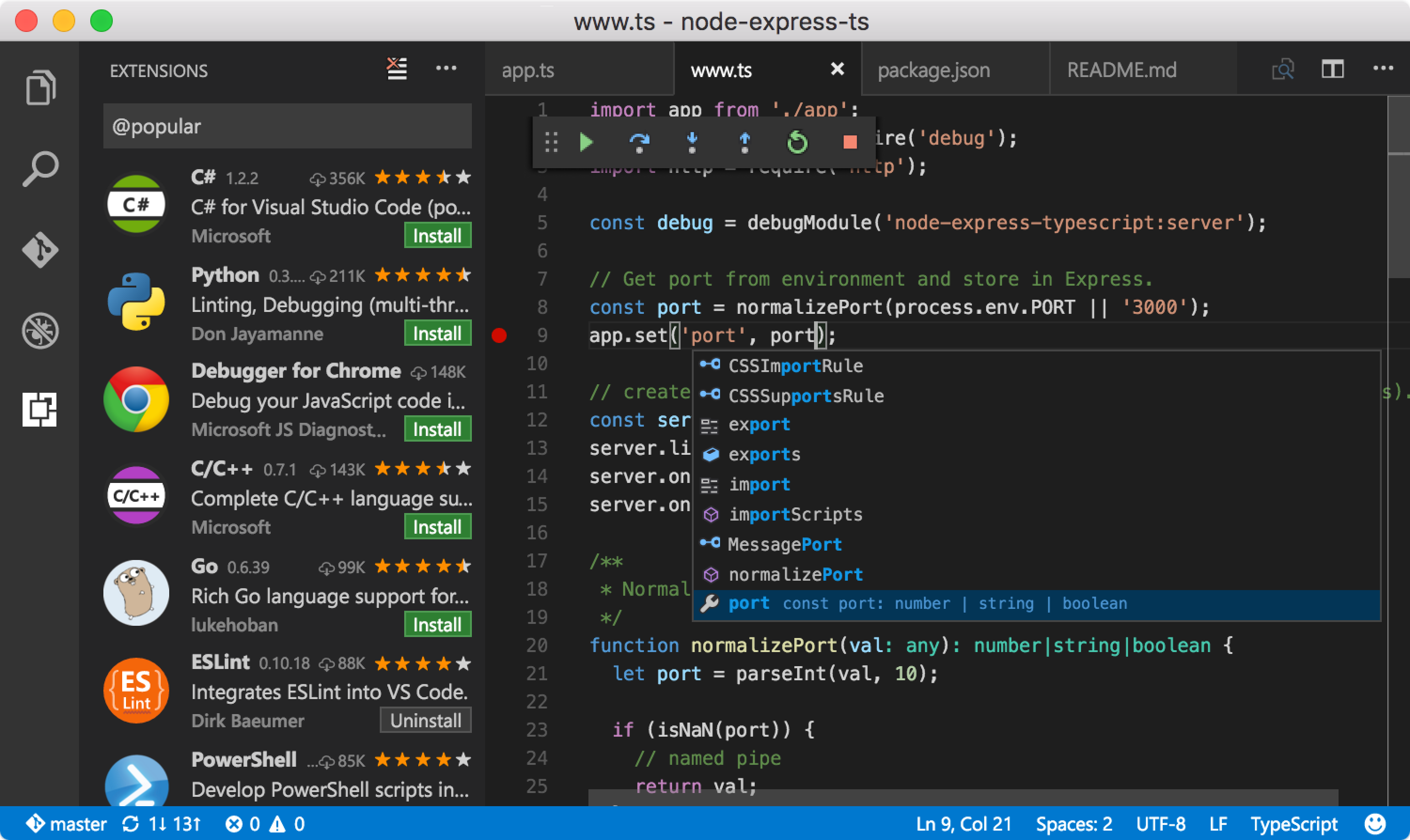
VS Code’s original UI, mixing icons from Visual Studio and Octicons
That left us with a mix of styles, weights, and colors. Customers started noticing, and no one was actively maintaining the icons. I led the initiative to begin cleaning up the iconography and creating a cohesive style that fits across our platforms.
IMHO, aesthetics-wise, the icons are the worst part of the editor, by far.
Pretty much everything that could have gone wrong did: inconsistent shades of gray, style and shapes (X icon), the maximize/un-maximize icon doesn’t properly illustrate it’s function, the “toggle output scroll lock” icon seems taken straight from an iOS password manager or something…
Iterations
After getting leadership on board, I partnered with our visual designer on style variations that matched our product branding. We explored a wide range of styles from solid and outline to rounded and playful. Below is a preview of our first iterations.
Early explorations ranging from outline to solid styles
As we narrowed the styles down, we knew this needed customer feedback to succeed. So we opened the design process up and invited the community in. The response surprised us.
Overall, I think the sidebar icons are a lot clearer as to what they do. Debug icon and Extensions icons particularly. The shape of the Source Control icon feels a little awkward to me, though it accommodates badging better.
Looking great! Three-layer symbols feel disproportionately detailed. Maybe save icon with star in upper-left would be more consistent?
I like the general look of icons but I don’t like how thin the lines are. For example, the search icon is a lot thinner here compared to the current version of VSCode
Better feedback
As we went through the feedback, we realized it was great for first impressions, but we wanted to get the icons into our customers’ hands to see how they’d hold up in real workflows. So I created a custom build of VS Code with the new icons and asked our community to try them out. The community surprised us again, testing the builds actively and sending more feedback.
 on Twitter
We’re working on improving @code’s iconography to make them consistent, clear, and modern. Let us know what you think.
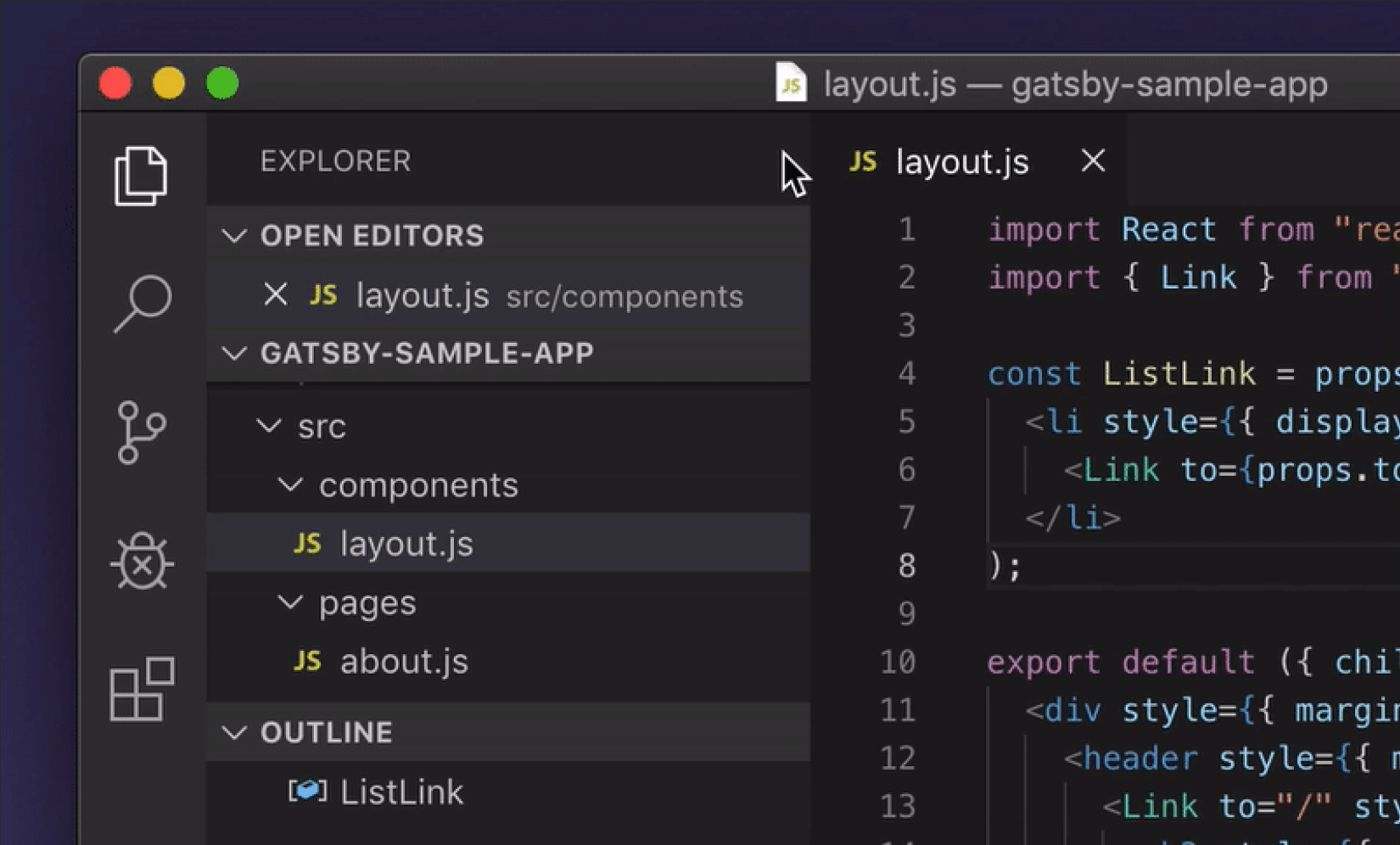
Once our customers had a sample build, we started receiving a flood of feedback, which felt amazing and terrifying. It covered first impressions of solid versus outline, glitches we’d missed, and other areas that needed updating. We worked around the clock to update the build as we iterated on the feedback.
Shipping it
After several months of iterating on the new icons, we finally shipped them and set them as the default. We went back and forth on which set to use, since the feedback was split. After several tests, we landed on the outline version because it resonated with most of our users and looked more “modern.”
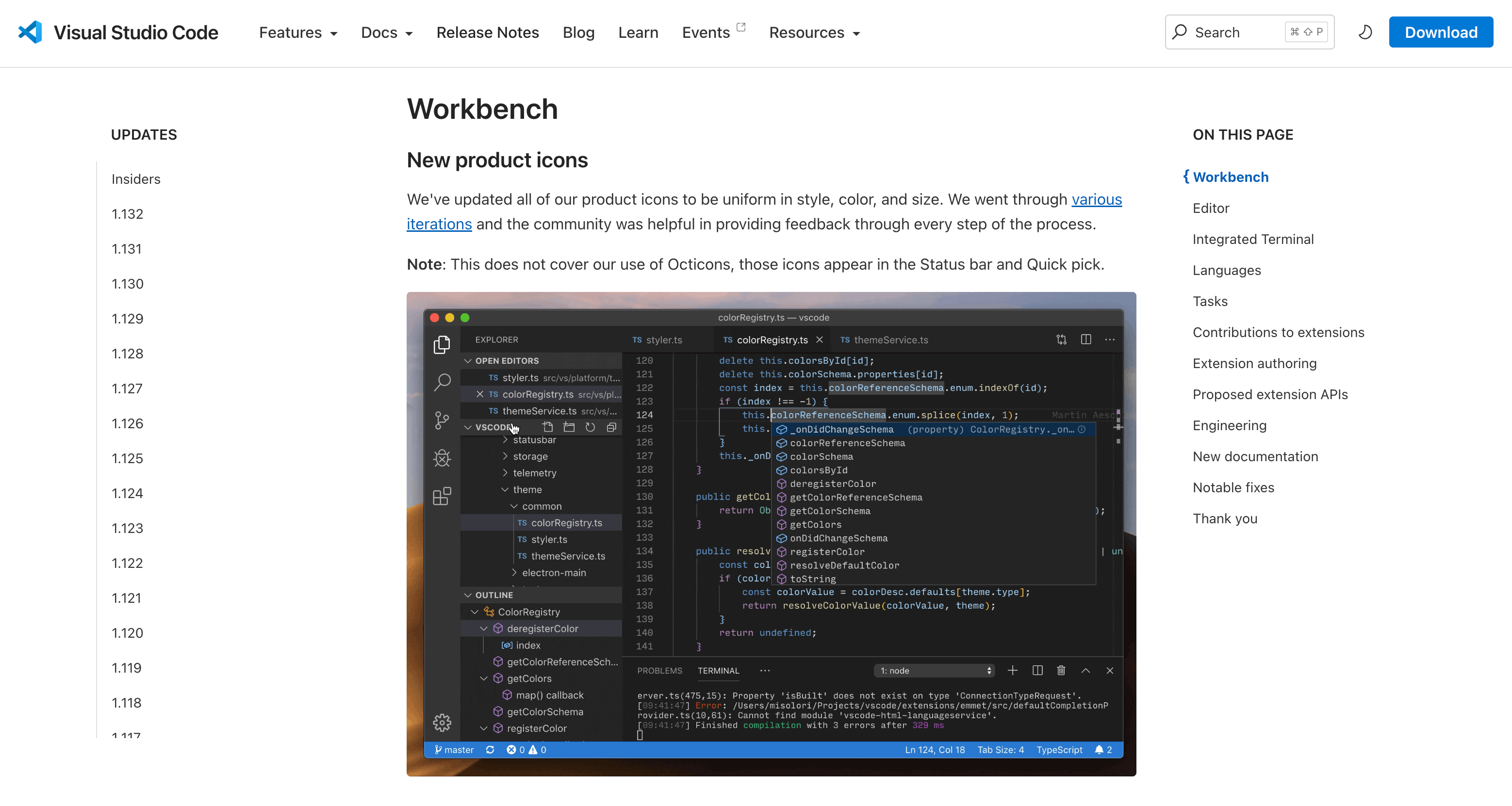
The release notes announcing the new product icons
Automating it
Once we updated the icons, we also wanted to update how icons are referenced in the source code. I created a command line interface (CLI) tool to auto-generate an icon font from our SVGs. We named the icon library Codicons, paying tribute to our previous icon library (Octicons).
The CLI generating an icon font from 417 SVGs
Open sourcing it
Once we shipped the icons, I knew it was time to give back to the community and open-source them, which Microsoft hadn’t previously done for design. So we published microsoft/vscode-icons on GitHub, published them to the Figma community, and created a plugin for Figma.
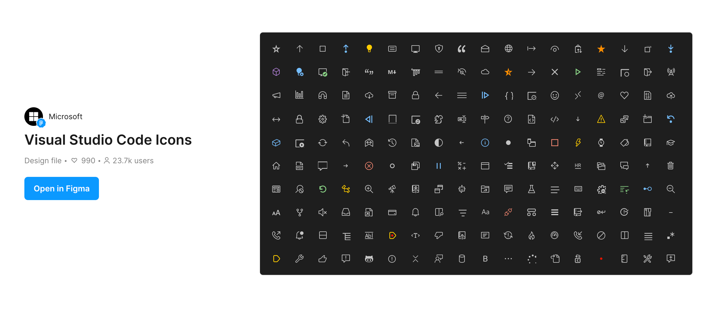
The icon library published to the Figma community
Scaling for the future
Research surfaced a new theme: customers wanted to customize the icons to match their own taste, since not everyone liked the outline style. Once the source code supported icon fonts, swapping icon styles got easy. That’s where product icon themes came from. Partnering with our engineer, I helped introduce a new API for product icon themes.
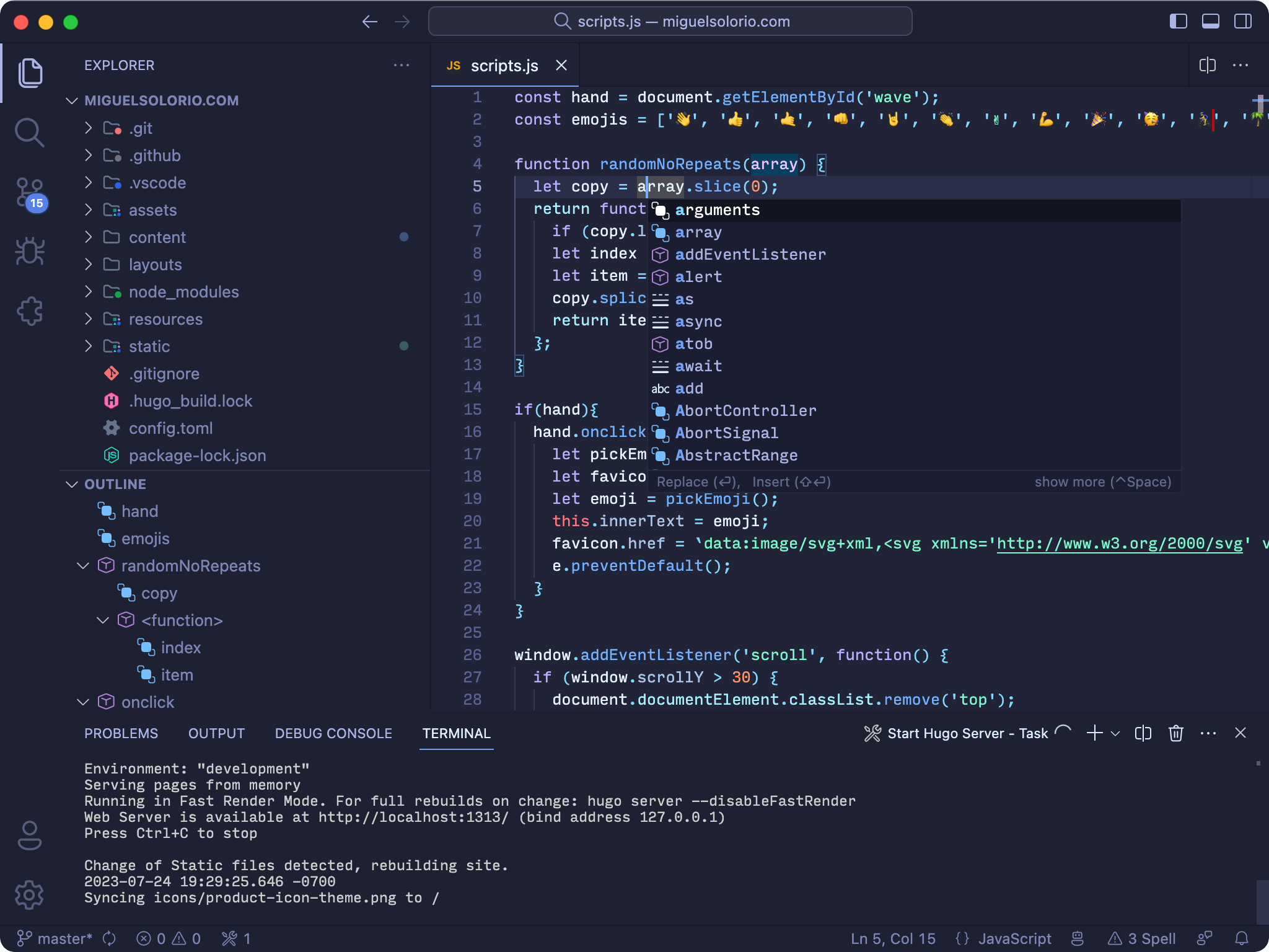
A custom product icon theme applied across the workbench
Made a Product Icon theme for VS Code with my favorite Carbon Icons by @ibmdesign! It’s so great that we can customize icons for VS Code now! 🤩
More goodie drops! Phosphor now has a VSCode theme with two variants, file and product icons 🎨🍫
Impact
Previously, referencing an icon meant three separate files, one per theme (Dark, Light, High Contrast), plus adding them in a separate file in your code. They would then be added as background images and lose any scalability benefits. With the new icon font, Codicons, we could define a dictionary of icons and then reference them in the code.
We also shipped the library as an npm package, for use outside VS Code or inside extensions. It took a year to reach 20k installs a week. It now averages over 500k a week, and has been downloaded more than 19 million times.